Project
Tater Time
Scope
Brand identity
Year
2025
About
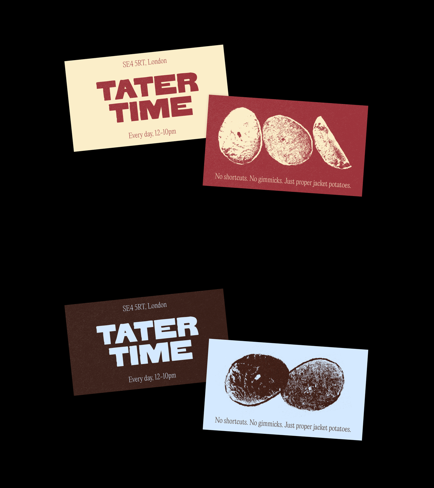
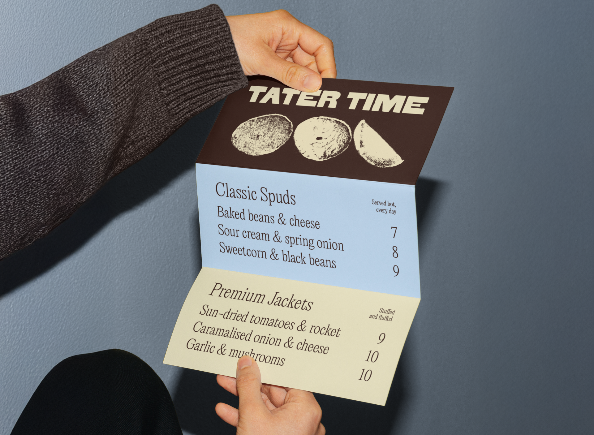
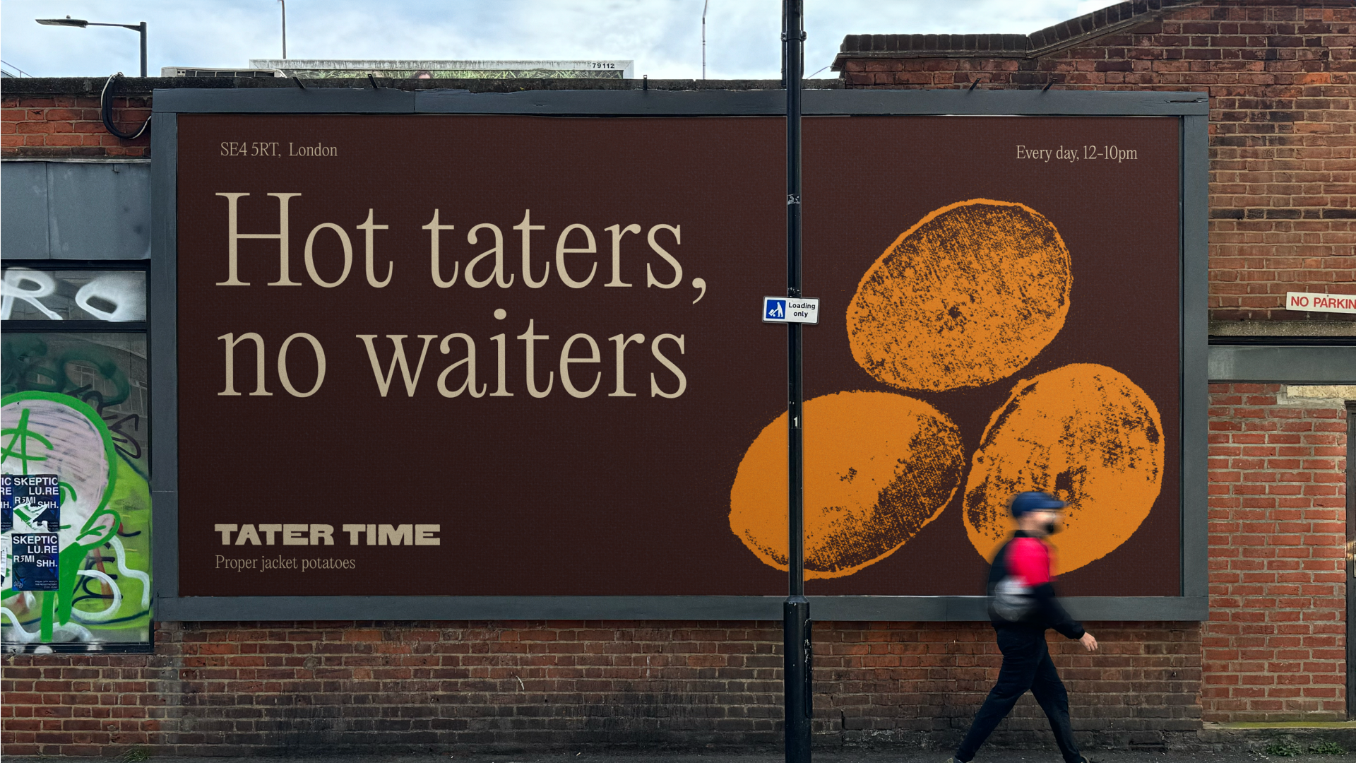
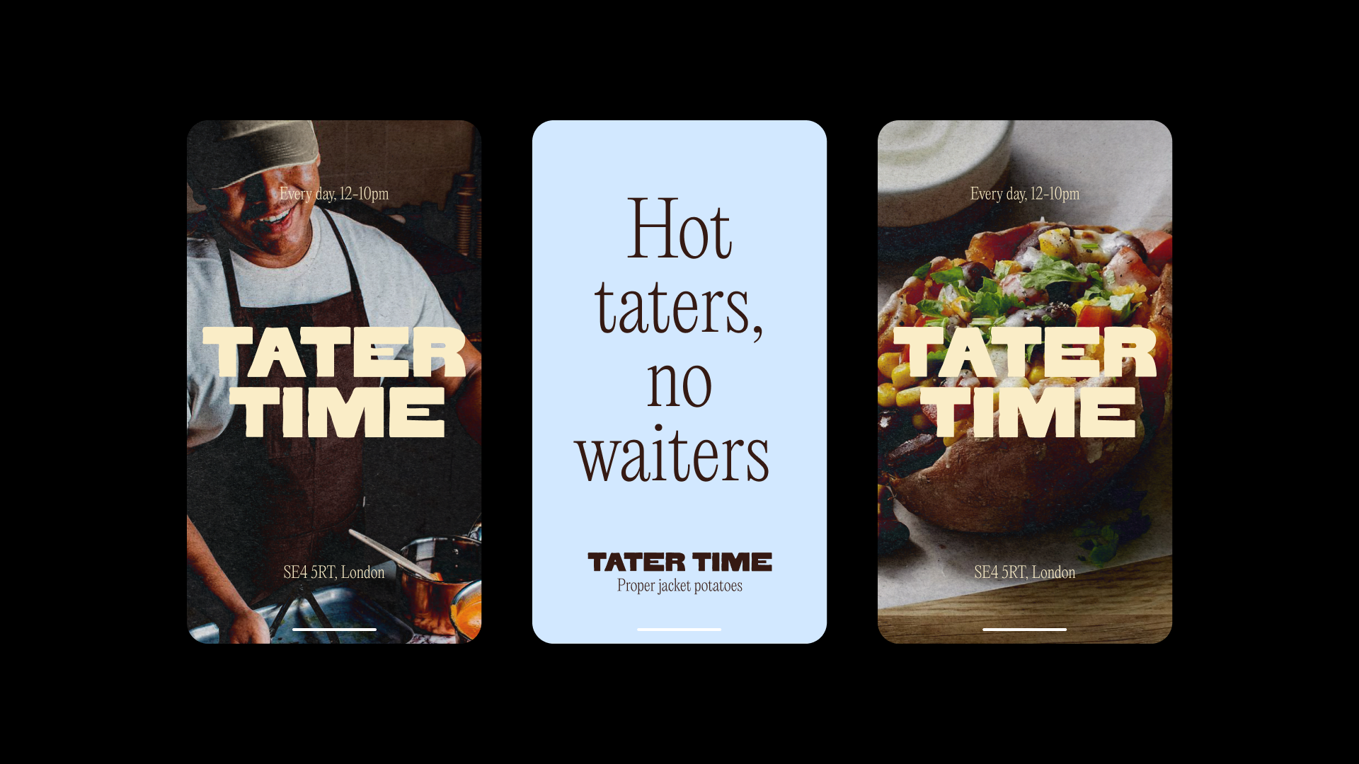
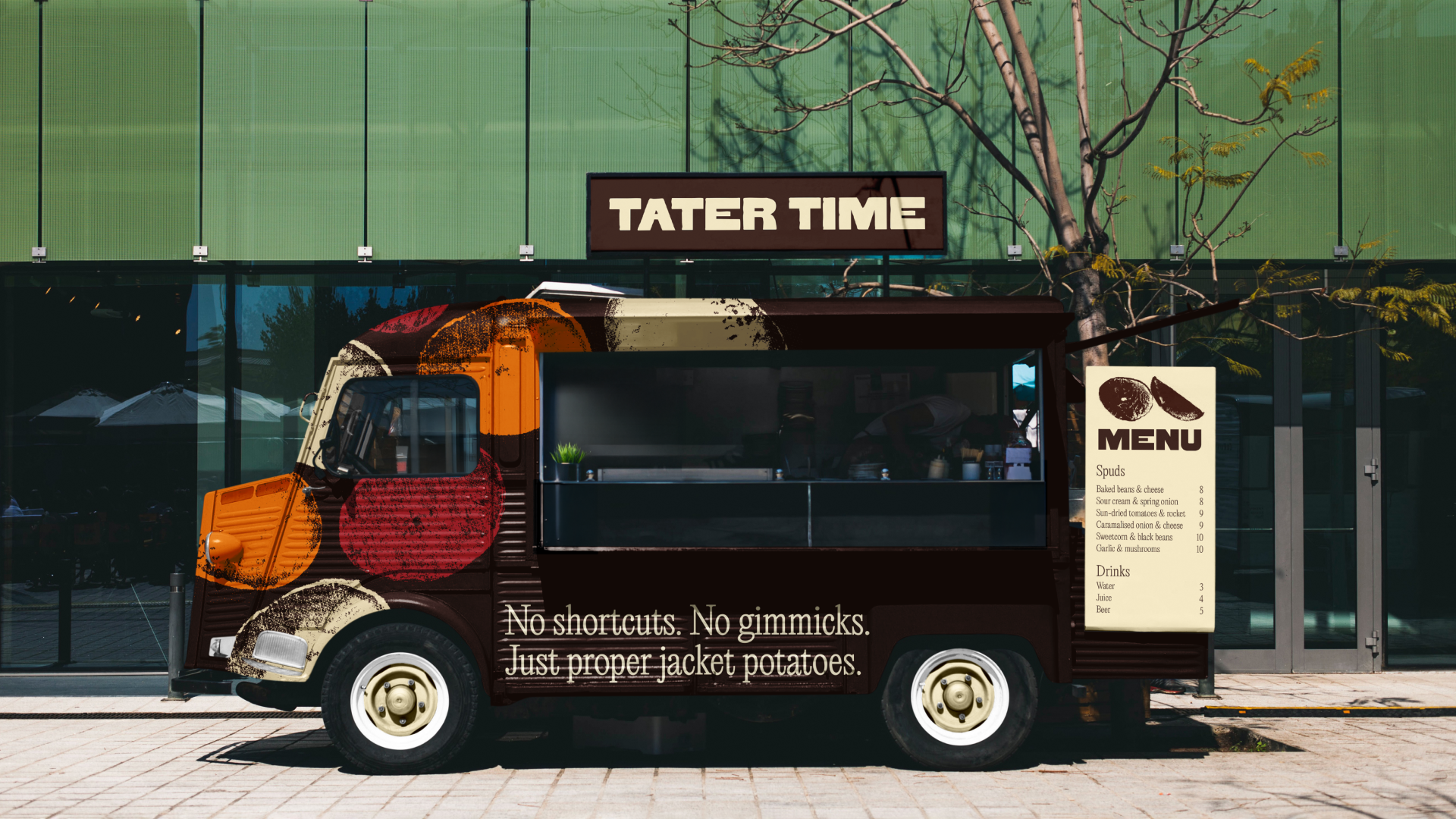
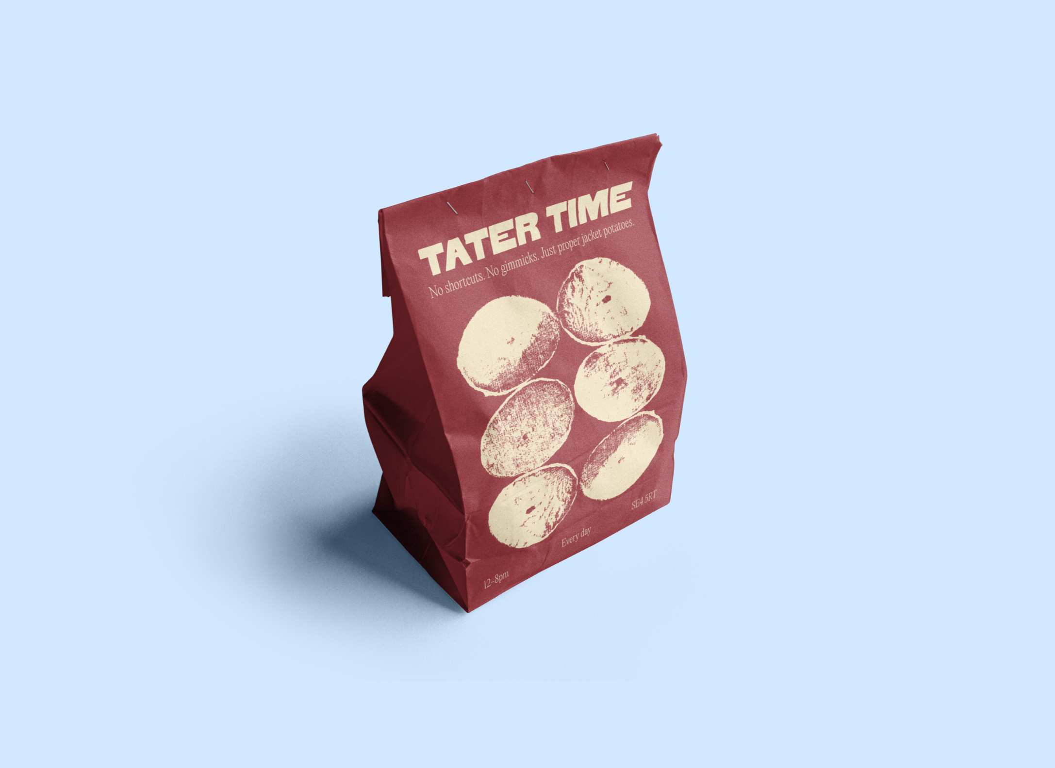
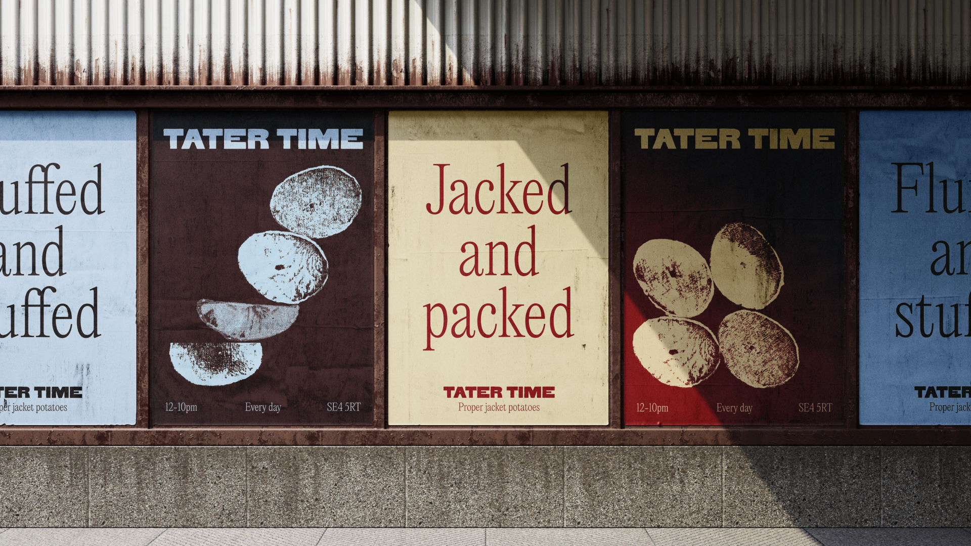
Inspired by humble, home-cooked roots, Tater Time celebrates the comfort of classic jacket potatoes. The branding captures the warmth of a small-town kitchen and the rustic honesty of potatoes.
For the logo, a bold typeface was tweaked to reflect the organic, handcrafted quality of potato prints – an element also used as illustrations throughout the identity. Paired with an elegant serif, the typography combination balances homemade character with timeless appeal.